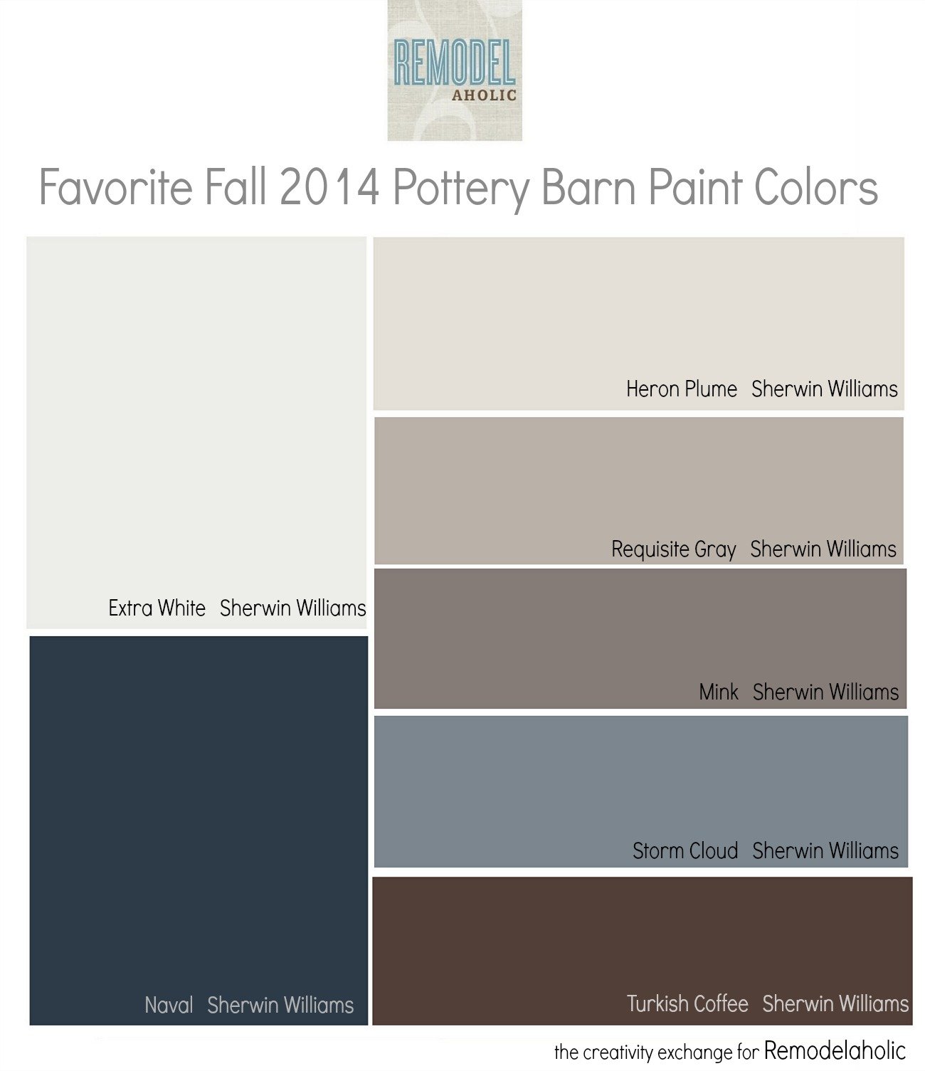
Favorites from the Fall Pottery Barn Paint Collection
This post may contains some affiliate links. Please see our full privacy policy and disclosure here.
I love it when a home decor store like Pottery Barn does a paint color collection because it helps so much to know paint colors used in rooms in their catalogs. Envision colors in a space is so hard and seeing a color on a wall in a decorated room makes all the difference. By the way, some of the most popular paint colors over the last few years have came from colors in past Pottery Barn paint collections.
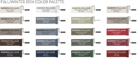
Pottery Barn and Sherwin Williams recently came out with their fall 2014 collection and as usual, I pretty much loved every color. Just look at this color goodness:
Not only are these colors beautiful, they are also very reliable and most of them work very well in a variety of lighting situations.
So today, I have gone through and picked a few of my favorites from the fall collection for this month’s color palette. Here are my fav’s and this month’s color palette:
I am really loving Heron Plume right now and it’s only recently that I started seeing it being used. It’s really quickly becoming a favorite with designers and home builders:

Heron Plume Sherwin Williams
I also love Requisite Gray because it’s another fresh transitional warm gray that has a nice mix of warm and cool undertones that will work well in almost any home:

Requisite Gray by Sherwin Williams
Naval is a gorgeous navy and it’s one of the most popular dark blues being used today:

Naval from Sherwin Williams
I was excited to see Extra White by Sherwin Williams used in the collection because it’s probably one of the best true white paint colors on the market today. Extra White has a very neutral undertone and it picks up the hues in the space:
Extra White by Sherwin Williams
Svelte Sage is a new color to me but I really love it because it’s a transitional light green that has a warmer gray undertone that helps to neutralize the green:

Svelte Sage by Sherwin Williams
There are so many great colors in this collection and you can also look through the Pottery Barn website for examples of these colors used in their spaces and catalog here.
If you’re looking for more color inspiration, you can find tons of color palettes and room examples on my blog here. Also, be sure and check out my “Pick a Paint Color” board here on Pinterest for almost 500 paint colors and more examples of rooms painted in these colors.
Thanks so much for stopping by!
Cheers!
Cyndy
———————————————
Don’t miss out on Cyndy’s other paint recommendations:
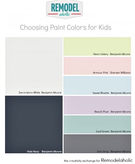
Choosing Paint Colors for Kids
Choosing the Perfect White Paint Color


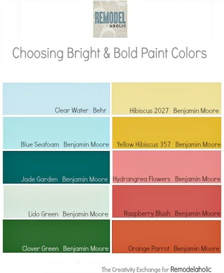
Tips for Choosing Bold and Bright Paint Colors
An Easy Paint Color Strategy for the Whole Home

Transitional Paint Colors for Balanced Warm/Cool
Cyndy is a color expert who has transitioned from the fashion world to the design world by helping others choose just the right paint colors for their homes. Cyndy takes the guesswork out of choosing paint colors and has been sharing her tips and paint color palettes with her readers for more than four years on her blog The Creativity Exchange.
Cyndy lives in East Texas and is an artist working with designers to create commissioned paintings that enhance the color and design of a space.


Would SW Passive Gray also go with those colors?
I.ve used Sherwin Williams requisite grey…now I’m having trouble finding a blue tone to go with it..any suggestions? Doing an upstairs attic converted to a dorm…want to put a blue of some sort to give it some life…plse help